

These 7 mistakes RUIN the User Experience of your website


Have you ever tried NOT focusing on User Experience? No? Good! Because ignoring user experience is one of the worst mistakes you can make when trying to reach your target audience in 2022. However, the problem is that most businesses think they actually provide good user service when they don’t or unconsciously ignore important aspects. But when you realize that your website bounce rate is too high or you don’t gain any leads although you provide high quality content, then you can be sure that something is off.
In this article I will talk about the seven most common mistakes businesses make regarding user experience and how to avoid or fix them. Spoiler alert: This will not be your typical “Just improve responsive design” article – there are some great ideas and new impulses waiting for you!

You don’t consider mobile devices
Ok, let’s start with the most obvious one. I’m not telling the news when I say that the majority of people access websites through smartphones or tablets. This is even backed up by statistics from august 2022 which claim that about 62 per cent of website traffic comes from mobile devices. Just a comparison: In 2015 only a little bit more than 30 per cent of all website accesses came from mobile devices. When looking at these numbers, you might have a clue what we can expect for 2025 or 2030.
Responsive web design is something the majority of businesses consider but don’t execute quite well. Either slow loading times or bad font size ruin the whole appearance of a website, therefore also the experience for users. The main issue is that many websites provide a lot of content which is actually a good thing but in the mobile version the page appears to be too big and users will be overwhelmed by the amount of content displayed. But this is not the only issue.The devil is in the detail.
Here is a list of things you should consider when optimizing your website for mobile devices:
- Optimize loading times of your website (for example by optimizing picture format)
- Make specific content parts invisible for mobile devices
- Change the design format for a better overview
- Make interactive elements (e. g. call-to-action) easy to reach
- Fluid layouts which fit the resolution and size of mobile devices
- Consider typography / font size
- Optimize loading times of integrated videos
- Use modern design tools such as Adobe UX to create precise prototypes of your website which include responsive design

Bad Content prioritization
Sliders on your website might seem to be a good way to guarantee variety but they’re actually bad for user experience. Whenever I visit a website which displays sliders I don’t see variety – instead, I see a website which struggles to prioritize content.
-> You always have to ask yourself the question: What do users need to know and how can I communicate key messages as precisely as possible without giving too much information?
Many companies fail to communicate “on point” and therefore fail to speak directly to their target audience. You need to consider that there are plenty of competitors out there who offer similar goods or services as you. (Potential) clients are aware of that – which is why they will leave your website if you don’t prioritize content and communicate clearly what you offer and how clients take advantage of that.
The dwell time on websites is sinking because users have many businesses to choose from. All pieces of useless information increase your bounce rate. Bad content prioritization might not provide useless information but it will confuse your visitors which has a similar effect.
There are exceptions of course. Sliders are totally fine when you want to show pictures or customer reviews but don’t use sliders to share important business information or to communicate details about your services.
You ignore search intent
Imagine the following situation: You need advice for your marketing and search for “content strategies 2023” to find an answer for your problem. You open a suggested blog article which seems to provide a proper solution but it turns out that the article only talks about digital marketing in general and barely gives information about content. After reading the table of contents you leave the website to find a better source of information.
Don’t make the mistake and only care about keywords when choosing a headline instead of considering what users are actually searching for. Your blog articles don’t gain the attention of your target group because you probably choose keywords with high search volume and low competition but you use those keywords wrong. Example: Brand names are often searched by people who look for products but many websites create informational articles around them. These articles are doomed to fail because they might appear high in the google search rankings at first but nobody will be interested in opening and reading them.
-> The next time you want to write a blog article, ask yourself: What does my target audience search for?
Always analyze your competitors to see which blog articles work best. Before I write a blog article I always search for the main keyword and have a look at which headlines the first ten pages in the google rankings use to get further information about the search intent regarding the keyword.
You don’t bring your blog articles to the next level
I want to start this point by asking a question: Who do you write blog articles for? The answer is easy, you obviously write them for your target audience because they read those articles. However, it seems that a vast majority only write for search engines like google. This is not a bad thing at all because without considering SEO criteria your articles will lose a lot of potential. But the focus is always on your target group.
Users don’t have any patience. They seek out solutions without having to search for too long. Therefore, you should provide a clickable table of contents in your articles to guide your readers. To provide them a better overview about the key information, I also recommend giving a short summary at the beginning of your article. But this is not where the journey of “I give my readers what they want” ends. Use pictures or videos and don’t be afraid to involve emotions by, for example, adding memes. Include some exciting storytelling and involve readers with questions and remind them to leave a comment below. Listings are also a good way to provide information easier to read.
Just ask yourself what you would like to see in a blog article. Don’t only focus on statistics, numbers and search engines. It is human beings who read your articles and they want emotions, easy to process information and quick answers to their questions.

You are not unique
What makes you different and better than others? Without knowing the answer to this question you can’t communicate the value you provide. User experience is not only about providing quick solutions or to design your website in a specific way, it is also about being appealing to your potential clients. Your website needs to communicate a purpose.
At first glance, many websites seem to make everything right. They look good, they communicate clearly and the responsive web design works well. But when you look at those websites and ask the question “what makes them stand out and what can they do for me” you often don’t get an answer.
Write about what makes your services unique and how clients take advantage of that. Go into detail to answer all possible questions. Publish use case studies to give insights into your working processes and to show off some results. Content is also a great way to prove your position as an expert and to answer important questions of your target audience.
Here is what has worked extremely well for me: Write a blog article about a specific topic and then write many smaller ones which answer questions regarding the big article. Example: Write a big blog article about what to consider for SEO in 2023. Then write smaller articles about SEO prices, methods and how much time it takes to succeed with SEO. It is important to improve your internal link building to send readers from one article to another. You have to send users on a long journey which awakens their lust for information.
It is also important for you to consider that many users look at your website and ask questions which might remain unanswered. This is why you should always check your website for potential information holes – is all the required information there? What is missing? What are visitors potentially looking for? Do I mention prices, customer reviews and working experiences? What about my USP and VP? You better check things a second time instead of leaving any mistakes.
The journey is too long
Call-to-actions are without a doubt important to generate more leads. But you should consider keeping ways to contact your business short. It doesn’t make sense to request users to contact you when they first need to scroll through a new site they open after clicking on the call-to-action. Keep ways for users short and make them immediately jump to a contact form when they click on a CTA.
In general, it is important to provide a good link and website structure. Without an user friendly information architecture, website visitors will get lost and your business will leave a bad impression. Bad link building and information structures will also have a negative impact on SEO.
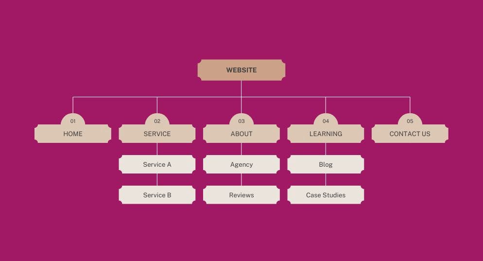 Example for a good website structure
Ignoring touch point mapping of users
When creating and improving your website structure make sure to consider the touchpoints of visitors. The best way to ensure this is to ask for feedback or to look up statistics on which sites were visited most commonly. You don’t only have customers or clients to get feedback from. Just ask some of your business partners what they think of your navigation and what draws their attention first. You better check yourself before you wreck yourself What happened to testing anyway? Many websites include broken links, bad information architecture or not working contact forms. Some loading screens take incredibly long and I’ve come across websites which don’t have an optimized responsive mode at all.
-> How is that even possible?
One explanation could be that sometimes things just don’t work anymore. But it’s much more likely that some website owners simply don’t give things a double check before publishing them.
It’s not only about basic website functions and if they work. Giving your website a double check first also prevents you from smaller missteps such as grammar mistakes or broken links. It is exactly those simple details which often prevent your target audience from contacting you. And it's sad to think about it because you may provide high quality content but it doesn't get the recognition it deserves because of two or three little grammar mistakes or non-working links. It’s even more sad to think about how easy it is to fix that.
You think your website is already great?
Good for you! But always give it a double check. The details are a deciding factor to provide great user experience – a badly placed picture in your responsive website, broken internal links and non-covered search intent of users all ruin the appearance and prevent users from contacting you. You better check these things again to make sure that everything works well and that you don’t have to worry about high bounce rates and missed opportunities in lead generation.
I want to know about YOUR experiences. What has worked for your business to improve user experience? And what was a key factor to improve communication with your target audience? Write it down in the comments down below, I can’t wait to read about some experiences!
You want to get further information about how to improve the user experience of your website? Then you should check out this article. It will give you a lot of valuable information about how to communicate with users and potential clients.